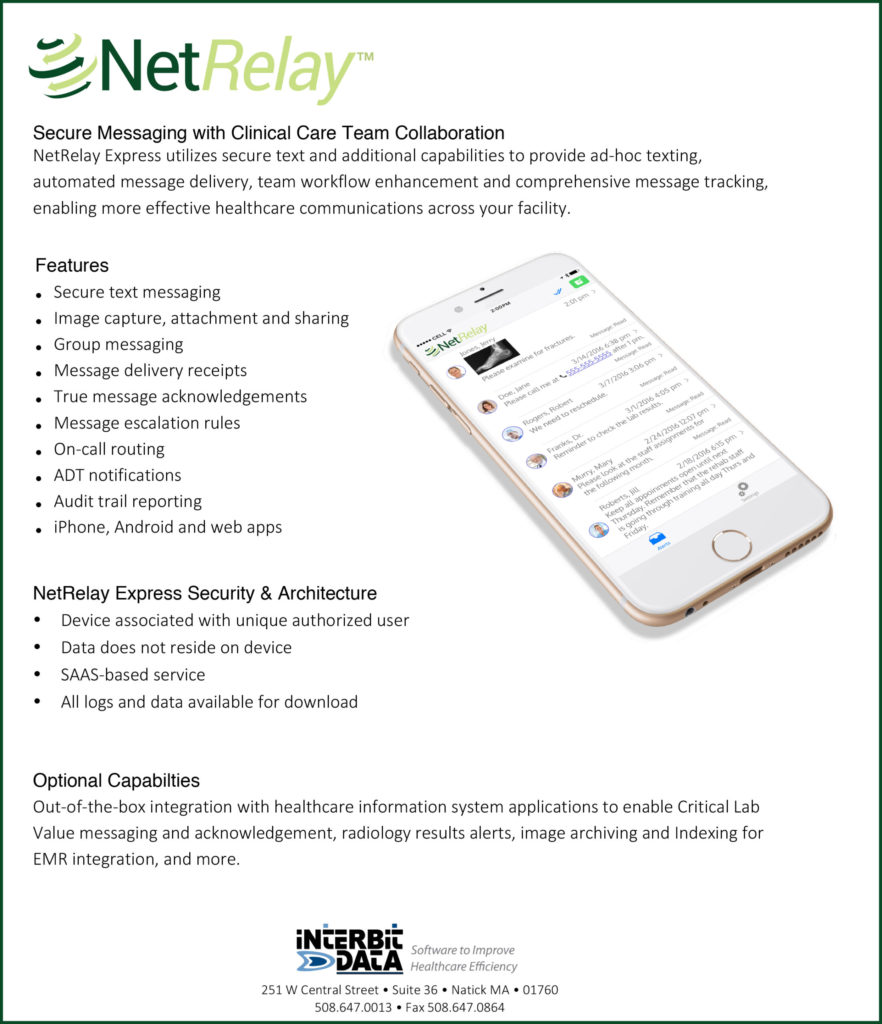
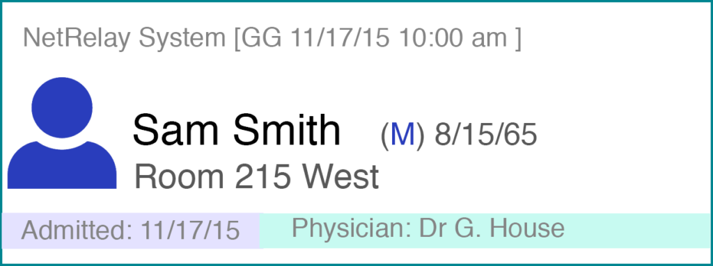
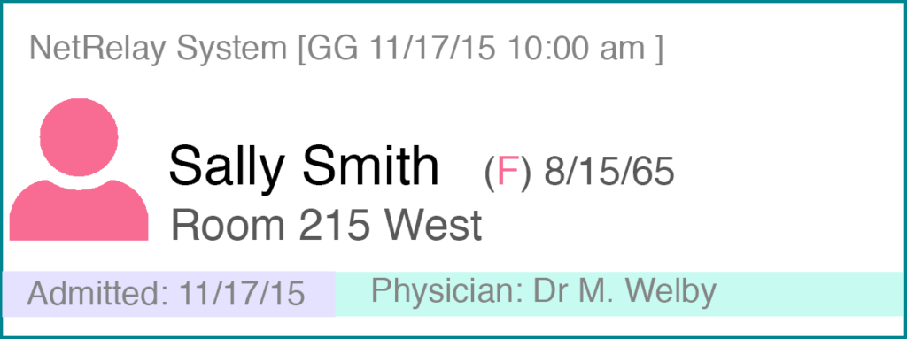
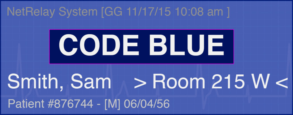
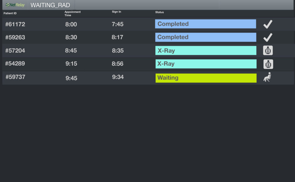
Making Technology Relatable

NetRelay

NetRelay is a secure messaging platform for HIPAA compliant communication between healthcare professionals. The sleek and clean UI uses recognizable icons for functionality and unlike competitors allows HTML for colorful tiles and custom graphics. I created a set of the tiles to expand the communication functionality.

A one page info sheet I created – I wanted a minimalistic look so I used a white iPhone and kept copy to the basics with a lot of white space on the page.
Whereas competing products simply displayed text messages NetRelay uses custom built tiles.
Admission alerts indicate when and where patients are going along and include the attending physician name. I chose pastels for a soft clinical look that was easy to read.
Housekeeping alerts orderlies when hospital rooms need cleaning or special attention.
Code alerts can go out to whatever team, floor or stations are needed. It was important to call out the patient name and room number in a larger font.
A large display UI was kept simple & clean. The information could be on a nurse’s desk or tablet. In this case for a radiology waiting room. The data was tied to the same feed as the secure text messages. I stayed with the same pastel colors as the app tiles.
I created this workflow, and all the images, displaying what is a fairly complex process into an easy-to-follow icon driven diagram so that decision makers at a hospital could understand the NetRelay communications integration.